One of the macroeconomic theories that continues to persist is the idea of the Phillips Curve. The Phillips Curve is the idea that unemployment and inflation are inversely correlated. This means that the higher the unemployment rate, the lower the inflation rate. This idea comes from A. W. H. Phillips’s study of wage inflation and unemployment in the United Kingdom from 1861 to 1957. The effect was then observed in the 1960’s in the United States, where it then influenced policies and continues to hold on to this day.
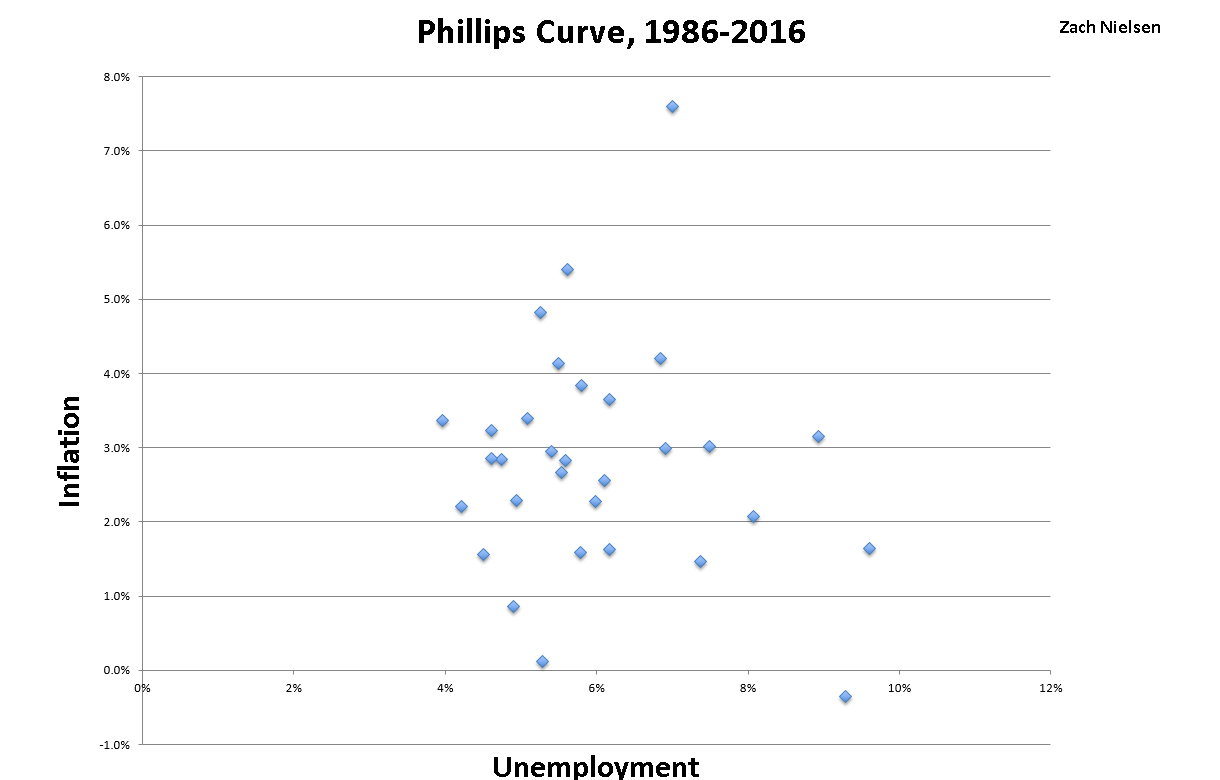
However, once the United States moved into the 1970’s and beyond, the Phillips Curve turned out to be untrue. Indeed, there seems to be no correlation between unemployment and inflation. In order to demonstrate this, below is a graph that shows the annual inflation rate and unemployment values from January 1986 to August 2016.

Looking at the graph, one can see that the scatter plot is extremely…. scattered. If unemployment and inflation were inversely correlated, the points would line up similar to a capital letter L: a high unemployment rate would result in a low inflation rate and a high inflation rate would result in a low unemployment rate. Thus, the idea of the Phillips Curve does not hold up.